Thursday, December 8, 2011

Houston, we have house plans

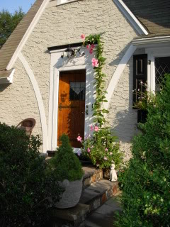
I received PDFs of our revised renovation plans today, and when I opened them I almost started to cry--because they are THAT awesome. We made some tweaks to the front of the house and while I liked the previous versions a lot, I absolutely love it now. Just as a refresher, here's what our house currently looks like:


And here's the plan for the new front exterior:
I know I'm not the most objective on this subject, but it's hard to get more charming than that, right? (Sorry I can't figure out how to make the image larger.)

We're so pleased with how this plan uses the bones of the original 1930s house and still looks like it could have been built in that era. Of course the interior changes are even more important, and we're very happy with those as well. The kitchen and current bath will be renovated and we'll add a master bedroom and bath as well as a small bedroom/office, a covered back porch, and an attic with about 400 square feet of bonus space that we can either finish during the renovation or wait and finish later. It will still be a small house relative to the average American home today, but for us, at the risk of sounding like Goldilocks, this one is just right.

Monday, December 5, 2011

On the wall

We have tons of family photos that I would love to display when our house is renovated, and I have a couple of ways I'm thinking of doing it. This first one is my idea for the playroom--large, simply matted photos of each of the three kids. I like how clean and fresh this looks.


The second idea is to have a gallery wall, possibly in the hallway, using photos, the kids' artwork, and other special/sentimental things. I've never quite known how to put one together, but this one is inspiring me (DIY instructions here).


Sunday, November 20, 2011

Color conundrum

We're starting to think about color for the exterior of our house, and there are lots of ideas floating around. We've ditched the stone idea and will just have a stucco exterior, still somewhat Tudor in style, with a slate entry porch floor and/or walkway. Feel free to chime in with opinions about our current top color contenders, knowing we'll feel free to ignore said opinions if they don't agree with ours.

1) Benjamin Moore Desert Twilight - a medium greenish gray. We'd paint the trim a light color and paint the door in a eye-catching color, as these homeowners did.


2) Benjamin Moore Durango - a darker version of the color above. Trim and door ideas same as above.


3) Sherwin Williams Ancient Marble - a pale gray-green. We'd paint the trim some version of white and the door black, as shown here.


4) Benjamin Moore Revere Pewter - more of a warm gray. We'd paint the trim white and the door could be either black or a more eye-catching color.

Friday, November 11, 2011

I can't believe it's not marble

No, our laundry room won't have this many windows or this many cabinets. It probably won't have a vase of fresh flowers over the dryer either. However, it will be in a hallway near the entry door from the garage so I feel completely justified in posting this gorgeous laundry area as my inspiration.


I love love love the idea of marble countertops over the washer and dryer, but I don't know if it will be in the budget. If it isn't, I found a new Formica called Calacatta that could be an excellent substitute. It doesn't have the maintenance issues of marble and is $50 less per foot!

Floored

For the flooring we hope to keep the hardwoods that we already have, put unfinished wood in the kitchen, new master bedroom, and office, and then finish everything at the same time. Right now we have a classic golden brown color in the living room and small bedroom, but strangely the larger bedroom is stained a darker brown--and we really like it. I've heard that very dark wood floors show dust/pet hair/dirt like crazy, so we don't want to go with an espresso or ebony stain. But we haven't had any issues with the darker brown floor looking particularly dirty, so we want to go with something similar throughout the house. Something along these lines would be lovely-


I like how they still have a golden tone to them, just slightly darker to add richness and go with the style and character of our home.

Tuesday, November 8, 2011

Master bath

When I first envisioned the master bath, I thought I wanted two pedestal sinks. It made sense for saving space, and it goes with the feel of our house. If we did that, we'd definitely need to get larger sinks with usable ledges around the sides.


That could work and look great. But the more I think about it, the more I'm convinced the master bath will be the bathroom where we need storage. It would make sense to have a long vanity with two sinks and storage underneath, but I have a hard time finding one that doesn't look generic. I kind of like this one--not the lack of storage nor the oak-y color, but the overall vibe is "modern cottage" to me.


The vessel sinks reminded me of this photo I had pulled from Ikea, and I actually really like these separate vanities side by side. I also like having medicine cabinets, though I prefer the ones in the top photo--the ones here seem too small or positioned too high.


For finishes, ideally I'd like them to be very similar to the the hall bath but slightly more sophisticated. I would repeat the white subway tile in the shower, but instead of plain white hex tile, I might splurge on some honed marble hex tile like this-


It costs more than the regular white, but it sure is pretty.

Hall/kids' bath

Our architect told me to start looking at finishes for the renovation, so I guess this thing might turn out to be more than drawings on paper after all. In particular I'm supposed to concentrate on the baths, which is no problem because I could look at pictures of bathrooms for hours. Actually, I already have...

The hall bath will be the kids' bath as well as the guest bath. That's kind of a tough combination, because on the one hand it should be kid-friendly and on the other hand it should look presentable when grown-ups need to use it. One conclusion I reached is that this bath (as opposed to the master) can have sinks with no ledges or cabinets below. Kids don't need a counter to rest a hair dryer on or lots of drawers to stash makeup and medicine. Basically they use the bathroom to take baths, brush their teeth, wash their hands, and, well, use the bathroom. So my first idea for a sink was this one (ignore the fish). I like the double sinks, the vintage look, and the chrome bar across the front that is a perfect towel holder for little ones.


But then I remembered an awesome schoolhouse sink I had seen, and I went off in that direction instead.


Adorable, right? I'd only want two faucets, not three, but the vintage feel is perfect, it's totally kid-appropriate, and it can also look grown-up and charming-


This is almost exactly the look I have in mind, except using a double sink instead of a triple-


In addition to the sink, I like:
  • separate built-in medicine cabinets with longer mirrors, low enough for the kids to see themselves. If these aren't in our budget, just two long mirrors (like those in the top photo) could probably work too.
  • small white hex tile floor, maybe with gray grout?
  • some type of cabinet or shelving on at least one side of the sink for toothbrushes, extra towels, etc.
  • a basket or two underneath the sink to use as laundry hampers
  • white subway tile for the shower
Next up--the master bath!

Wednesday, November 2, 2011

Timber!

Approval was received, and tree came down. It took a team of three guys four days to do the job, which provided hours of entertainment for the kids.


They took all the branches off first-


and then worked from the top down, cutting it section by section. Even though it was necessary, I felt a little sad to see the the huge trunk fall. However, I was also happy it fell in a controlled way and not, say, during a storm onto our house.


Don't fret too much, tree huggers--the city requires us to plant a replacement in the next 30 days.

Saturday, October 8, 2011

Front entry, take 2

So the front of our house currently looks like this-


Not too exciting. The porch isn't original to the house, and the previous owner went in a bit of a Spanish direction with some terracotta tiles that we're not fond of. The porch columns have also been eaten up by termites, so it has to be redone anyway. We also need to create more space in the kitchen for a dining area (there's no dining room), so our architect suggested we bump out the front kitchen wall by a couple of feet and go in a more Tudor direction with the entry. I don't have a rendering to post yet, but her idea is kinda sorta like this-


It has two peaks on the left side, a stone veneer arched entry, a steeper roof (so we can add an attic) and a dormer on the right side. The bigger peak on ours wouldn't be as high, and there wouldn't be a window there, but you get the gist. I had told her I really wanted the house to still look like it was built in 1932, and I think she nailed it.

Now I'm debating colors for the stucco, window frames and trim. I think I want a light color for the body of the house, not tan or olive. The house next door to us is tan stucco with dark brown trim and window frames, and I don't want to mimic that at all. This one is the closest to traditional Tudor colors that I've found that I like, with the lighter body and dark trim. But I like that the dark color is more of a greenish gray instead of traditional Tudor dark brown.


Here's an ivory/green combination that I like and that looks nice with the stone. (This is Kate Hudson's guest house. Not the little cottage on the left--the whole thing.)


I wish I had a better photo of this house, because I really like the color combo. The windows and bit of trim at the top are taupe-ish, which I think isn't as jarring a contrast as the very dark trim.

Monday, September 26, 2011

Our own private island

Our architect presented us with three awesome plans for renovating and expanding our cottage, and just in the nick of time--after spending a couple of weeks bumping around this tiny house like a pinball, I was almost ready to put it back on the market!

Our favorite plan expands the kitchen out toward the front by bumping out the front window and toward the back by a couple of feet as well. She's proposing a banquette-type dining area in the window and a small island in the center, which sounds heavenly. I like the idea of the island being small and functional, not necessarily a place for seating, since the seating area will be so close by and bar stools are a recipe for disaster with little ones anyway. I like these kitchens with both a banquette and an island--this first one in particular looks very similar to what I imagine she's talking about.


This second one I like for two reasons. First, I like the island made from the same materials as the rest of the cabinets and countertop--I think this may work better in our kitchen where there will already be a table and chairs in contrasting materials so close by. Second, Ryan really likes this type of table and I like to let him have an opinion in this process once in a while. :)

Sunday, September 18, 2011

Ikat

The Ikat trend is one I think I could embrace in some way as we rework our interiors. Love this fabric from, believe it or not, Laura Ashley.


It comes in several colorways--the green is pretty too, and I like the blue and purple accents.

Tuesday, September 13, 2011

Budget-friendly banquette

While brainstorming ways to add some type of expanded dining area to our home, I starting thinking about a banquette. It makes sense for a lot of reasons: It saves space, the cabinets in the bench add storage, and it goes with the era of our house. I don't want the entire thing built in--just a bench on one side, with a table and freestanding chairs on the other sides.


I became even more interested in the idea when I found numerous websites showing how people used IKEA cabinets to create banquette benches. This is one of my favorites (not the way they're using the round table and two chairs, but the bench itself). Genius!


The entire project can be found here: http://aubreyandlindsay.blogspot.com/2009/11/making-seating-bench-in-kitchen.html

Lighten up

For the past five years, we've had some variation of the same color scheme in every room in our home: red, golden yellow, and dark blue. I like how classic that combo is, but in our new place with its lower ceilings and smaller windows, it feels too dark and heavy. When we redo the house, I'd like to work with a lighter palette and give the whole place an airier feel. I came across this living room and was drawn to how bright and cheerful it is. We have a dark brown couch to work with, but the other elements are doable: pretty patterned curtains, bright colored throw pillows, white bookcases. Ryan probably wouldn't go for so much pink, but I might get some purple past him.


I've already started on the new palette with the gorgeous quilts my friend Katie made for the little ones' room. It makes me happy just looking at them!

Treediculous


We love trees as much as the next guy, but this beast must go. It's unhealthy, structurally unsafe, and within about 15 feet of our back door. Unfortunately this isn't Alabama, so you don't just call your neighbor and his cousin to cut a tree down. The process around these parts goes as follows:
1) Call the city arborist and ask for a preliminary evaluation to see if there's any chance you'll be permitted to take down the tree. If he says there is indeed a chance, proceed to step 2.
2) Call an independent arborist. Pay him to look at the tree and fill out an official arborist report.
3) Fill out an application for tree removal. Attach the arborist report and a check for the application fee and submit it in person to the city.
4) Wait a week or two until the city arborist comes for the official evaluation. Use Southern charm and cross your fingers he's still open to approving removal. If he does approve it, proceed to step 5.
5) Wait two weeks while every neighbor who lives within 100 feet of the tree has an opportunity to appeal the approval to the city.
6) While waiting, get bids from four tree removal companies. Choose the one who has insurance and also, as a bonus, returns your phone calls.
7) Receive final approval.
8) Have tree removed.
9) Enjoy your less hazardous yard, which just cost you more than you paid for an entire year of college tuition.

We're at step 6. Stay tuned!

Tuesday, August 30, 2011

Yet another kitchen idea

I had to throw this into the mix, just in case we go with hardwood in the kitchen instead of checkered flooring. Many of the other elements are the same--white cabinets, some open shelving, apron sink--but the dark wood floors and dark countertops give it a more sophisticated look that I think would still work in a cottage-style home.


Here's the same idea: dark wood floors, white cabinets, white subway tile backsplash, soapstone countertops. This may well be my dream combo for a kitchen.


And last but not least, one more example. Ours would never look so pristine, but the key elements are all there and oh so lovely.

Wednesday, August 24, 2011

Attic "conversion"

OK, so we don't have an attic to convert. But if by some crazy chance we get to include an attic/half story on our addition, I have plenty of ideas about what to do with it. First we need storage, so at least part of it would really need to be used as an attic. But for the other space...

A little bedroom or office with some bookshelves like these would be wonderful-


And our dream of all dreams: a playroom. So many things to love about this one, including all the shelving and storage for toys, the comfy seating area, the craft/game table and chairs, and the great set-up for the TV (here's how we could get it out of the living room!).

Tuesday, August 23, 2011

Kitchen crush

Found this kitchen while looking through images of checkered floors--this one is done in cork. Love the vintage feel of this, the warmth of the cork, the subway tile. The color is more bathroom than kitchen to me, but otherwise, just adorable.


I like how they used open shelving in little nooks where cabinets wouldn't fit--clever, and it would be so great to have a place to put cookbooks!


The entire photo gallery of this kitchen renovation can be found here:
http://www.countryliving.com/homes/renovation-and-remodeling/diy-dream-kitchen-0905

Sunday, August 21, 2011

Kitchen cabinets

Ikea has three styles of white cabinet doors that could work for our house: (L-R) Adel, Lidingo, and Ramsjo.


Unfortunately, two of them (on the left) are thermafoil and I would really prefer not to go that route--it just usually seems too plastic-like. That leaves me with the Ramsjo, which is painted wood. I like everything about it except that the "white" is more like a white-wash that leaves it with an awful pink undertone. I'm wondering if we could have the doors (and everything else that shows) painted a white of our choice before installing them. Because when done in the right color, these cabinets can look great-

Friday, August 19, 2011

Built-in ideas

Another of Ryan's requests (and something I'd like too) is to add some built-ins to the house. He'd also like to add a gas fireplace to the living room, which is a nice-to-have but not necessary. I think these built-ins are sort of what he has in mind.


My concerns are these: first, with a fireplace, where do we put the TV? We don't have another room to put it in, and we don't plan to get rid of it. It could be mounted above the fireplace, though I've been in homes with that set-up and I think it's an awkward position--it hurts your neck. If we did go that route, I like the idea of hanging a big frame and then hanging the TV in the center of it, like this-


But in a set-up like that, where is the DVD player? The Wii? It just doesn't seem that realistic for our family. An alternate idea I've been thinking of, especially if adding a fireplace isn't in the budget, is to create an area that is similar in feel to a fireplace/built-ins, but with closed cabinets in the center instead of a fireplace. Imagine something like the room below, except instead of windows on either side of the cabinets, bookcases extend floor to ceiling.


The closed cabinets would provide a place for electronic equipment as well as stashing kids' toys, and Ryan would still get his bookcases. It's a thought. This wall is the first thing you see when you walk in the house, and I want it to be attractive, not too cluttered looking, and still functional.